Maui Adventure Store Microsite
The Challenge
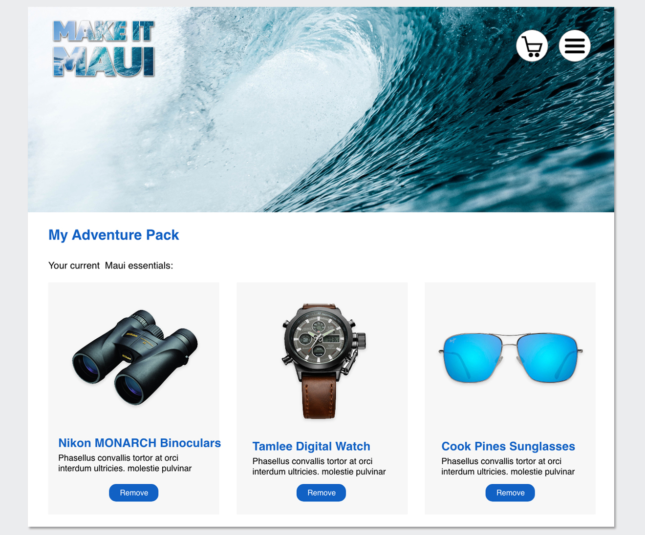
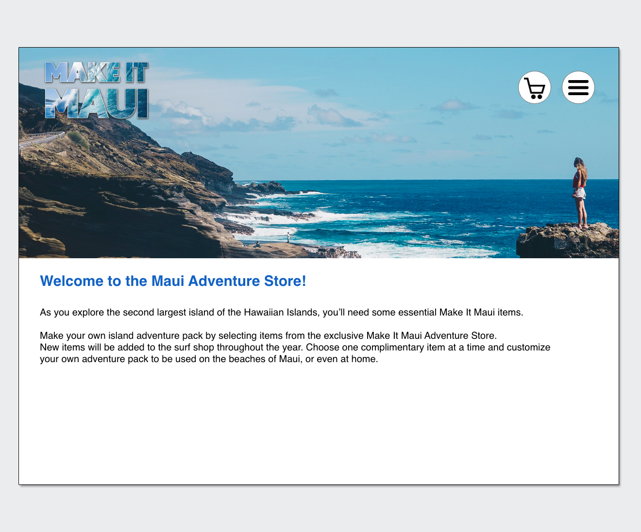
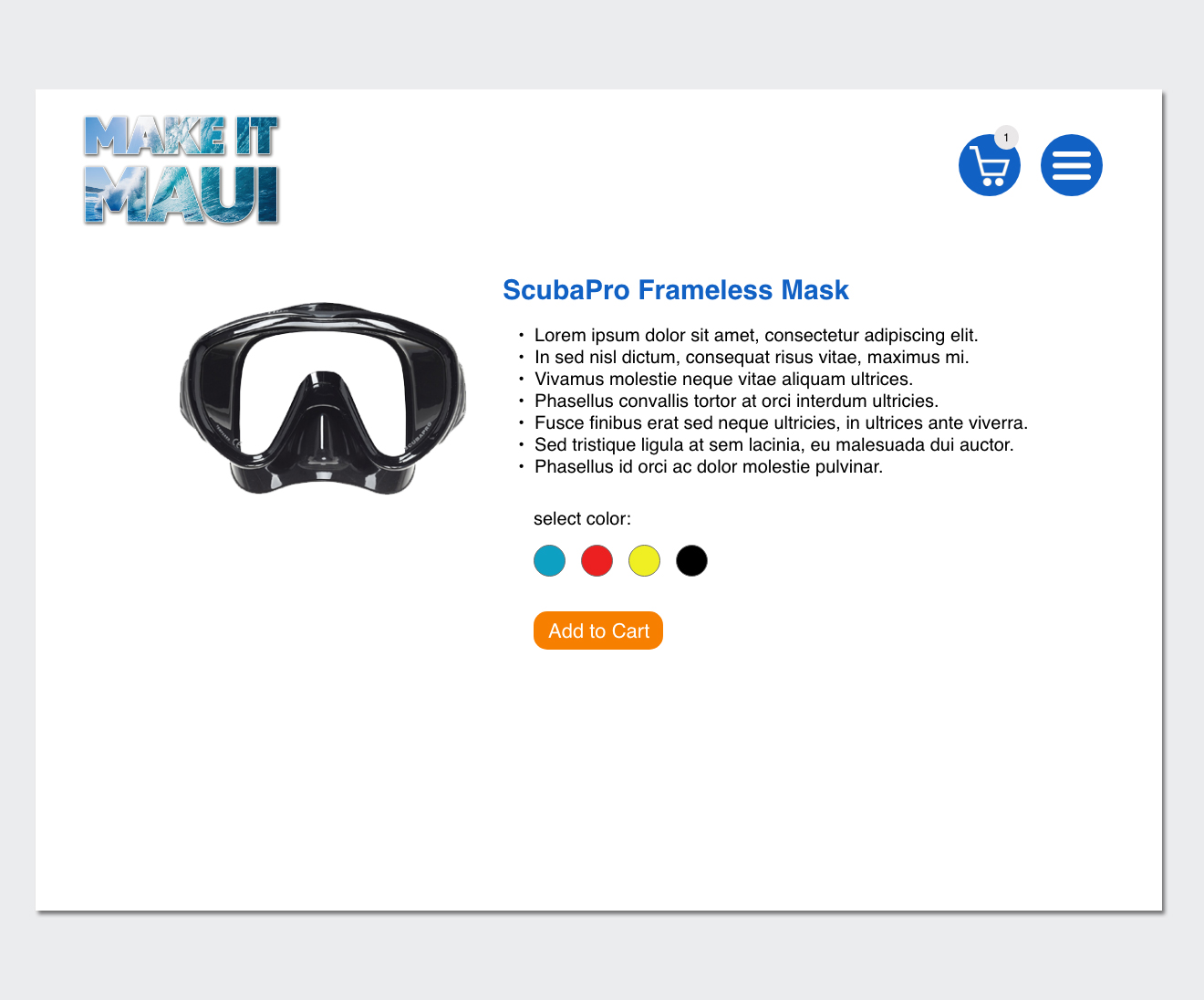
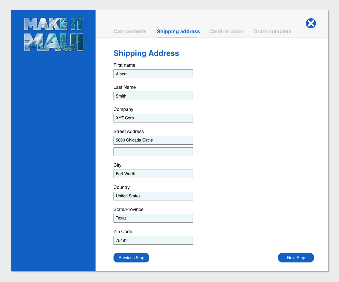
One of the main objectives of a GPS sponsored sales contest is to keep participants engaged by driving them to the program website. In addition to leaderboards and destination videos, GPS marketing decided to add an online store to the mix. The "Maui Adventure Store" allowed participants to order items throughout the duration of the contest. If the participant was a winner, the items they ordered would be shipped to their home for use during their trip to Maui.
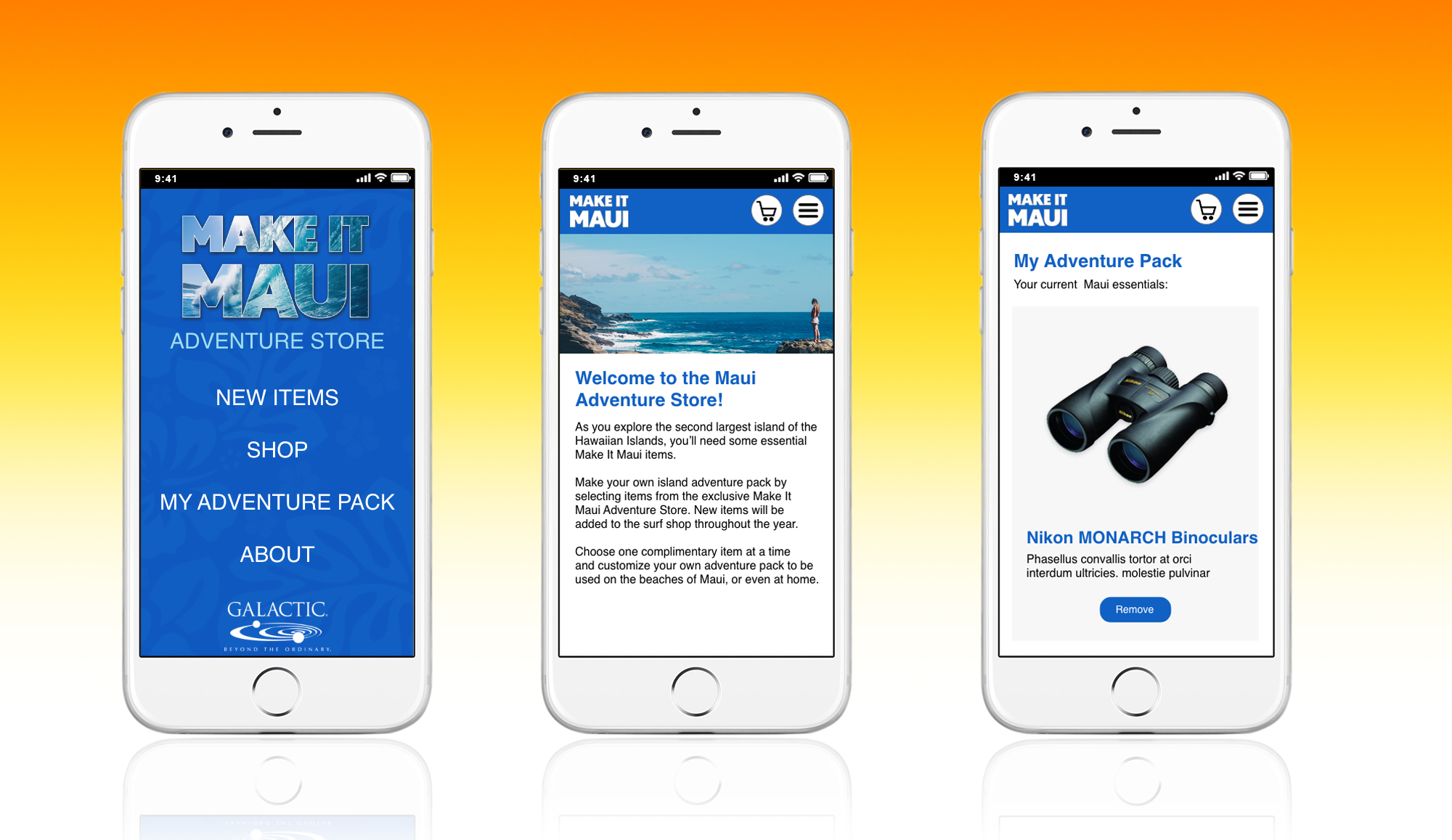
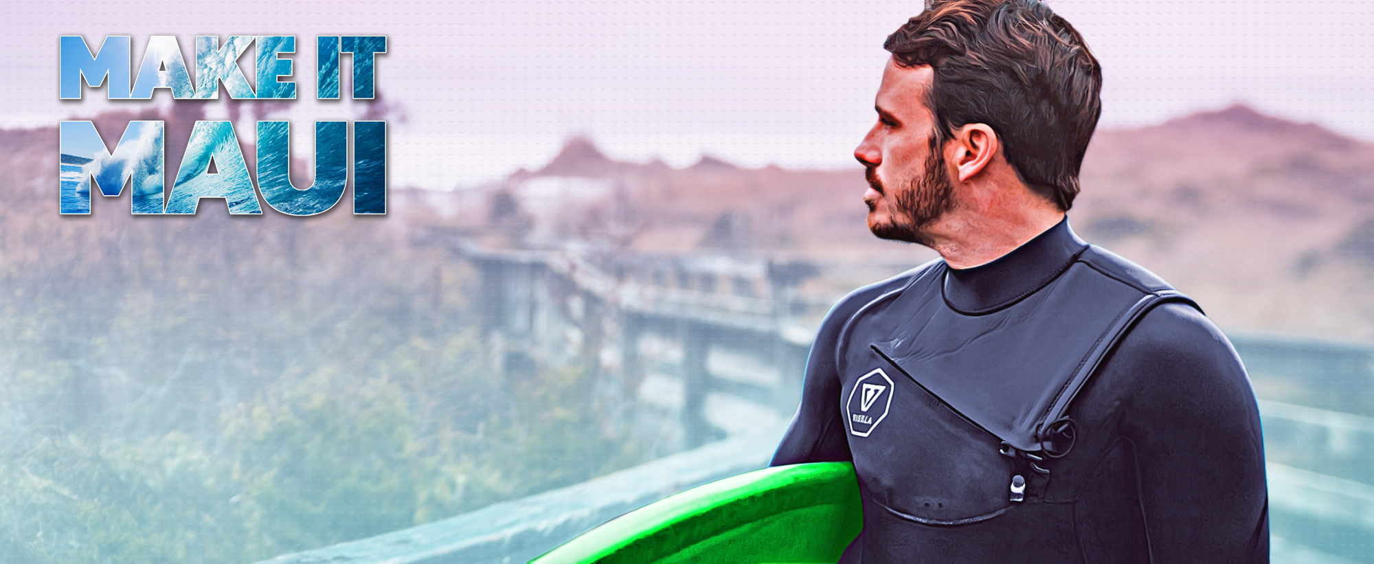
Although the Adventure Store concept was a success, the store itself was not much to look at. Participants got to the store via a link on the Maui Contest website. When they arrived, they were greeted by a single page on the GPS merchandise catalog site. With the exception of the Make it Maui logo, the page did not consist of any noticeable branding or Maui themed graphics.
The Solution:
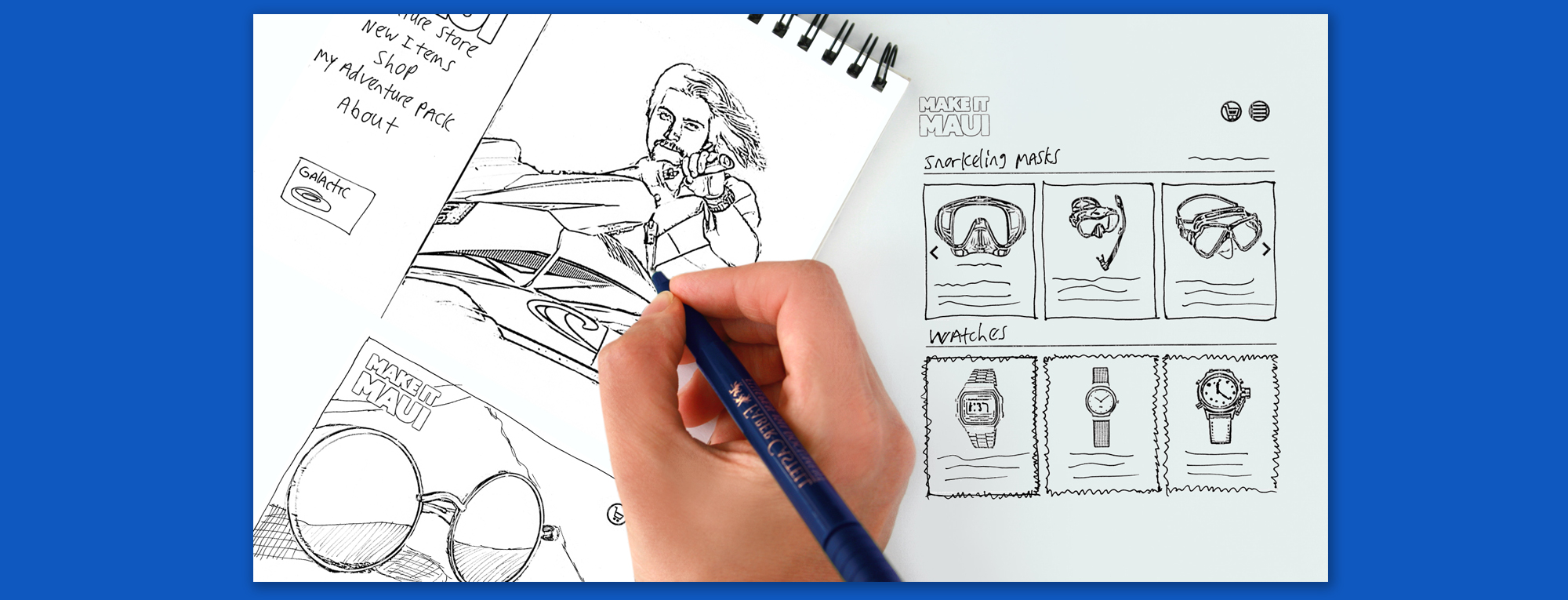
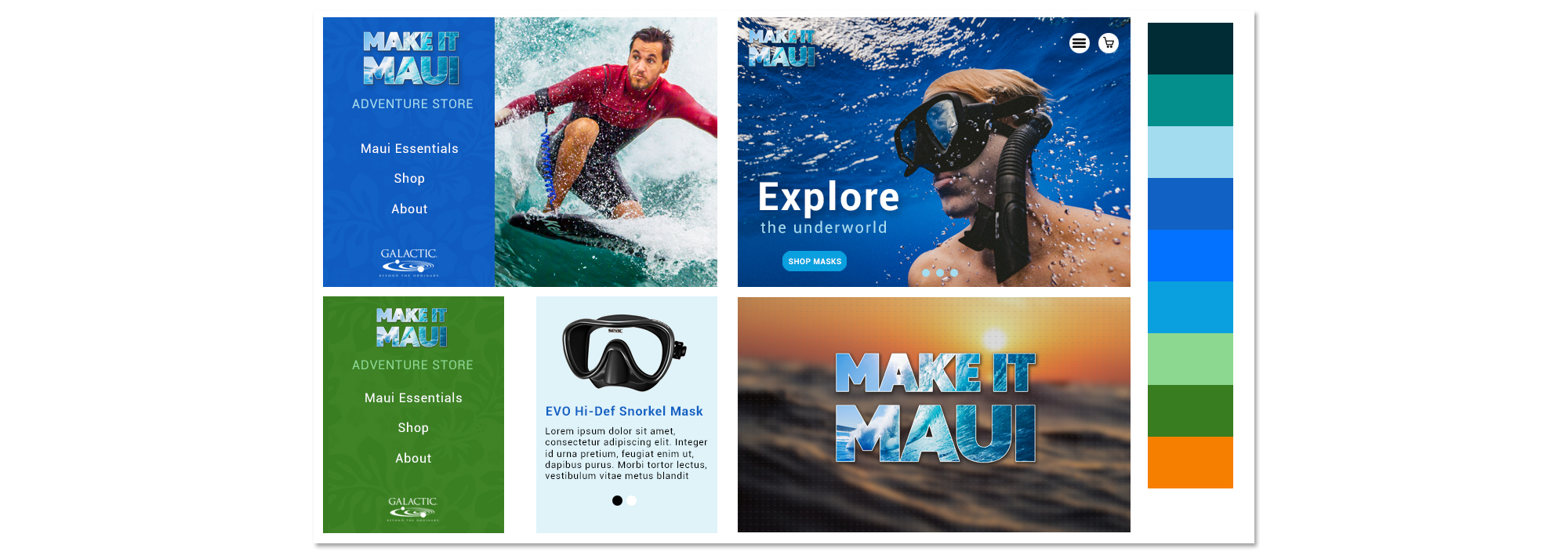
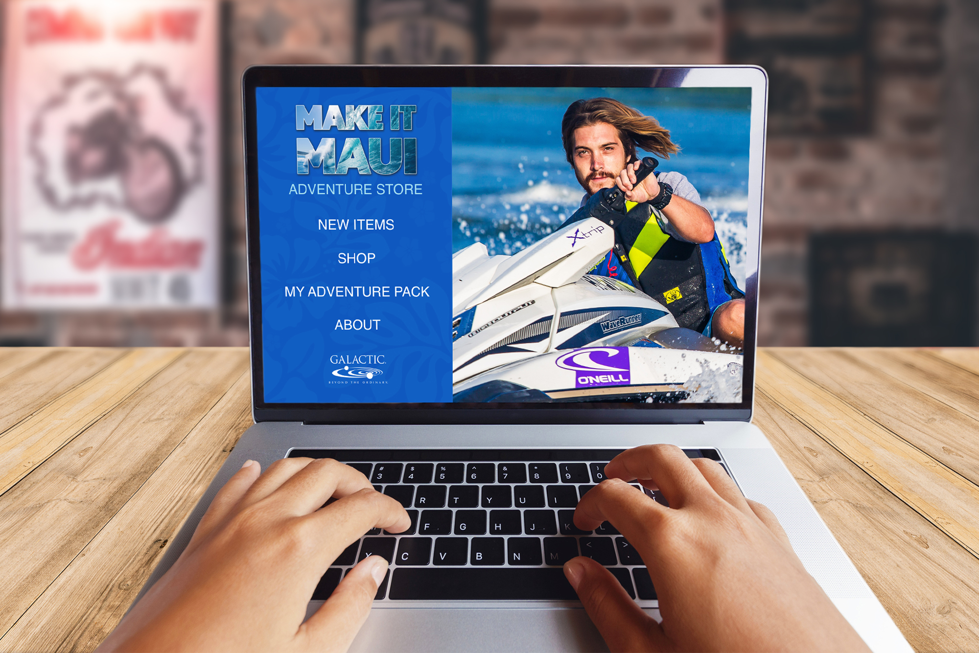
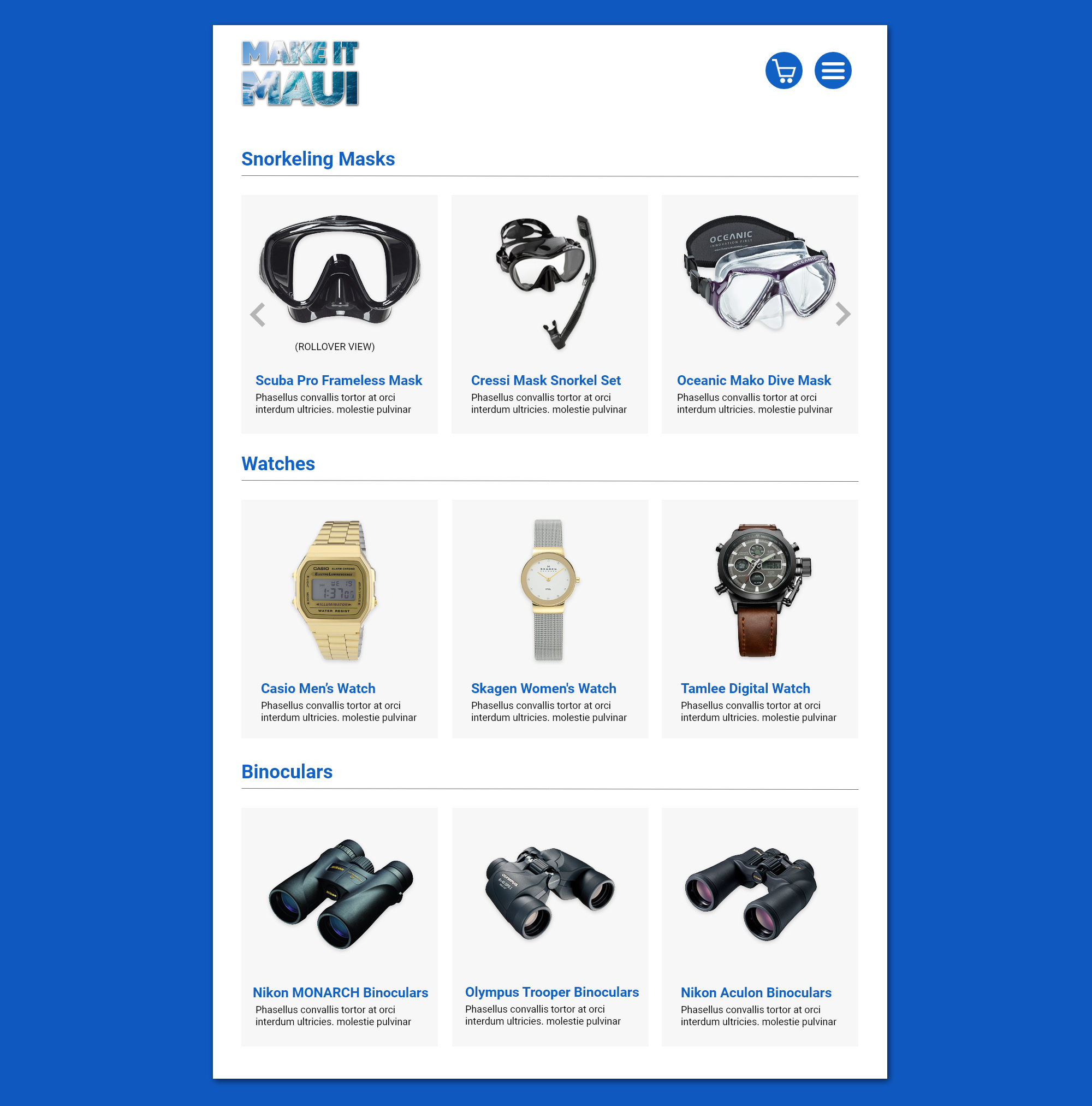
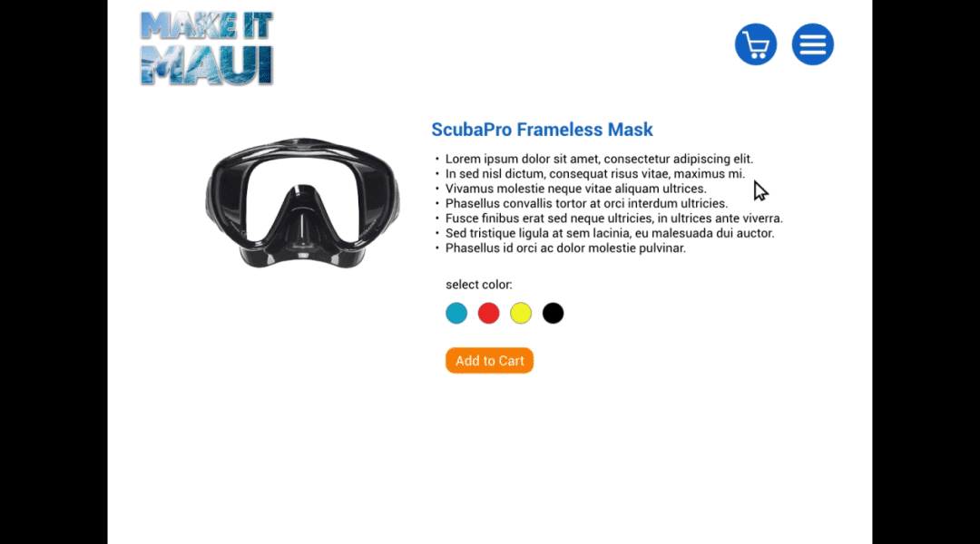
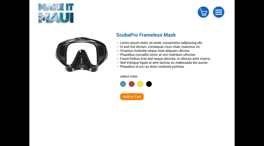
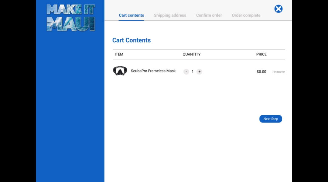
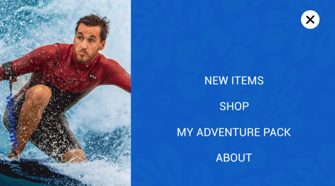
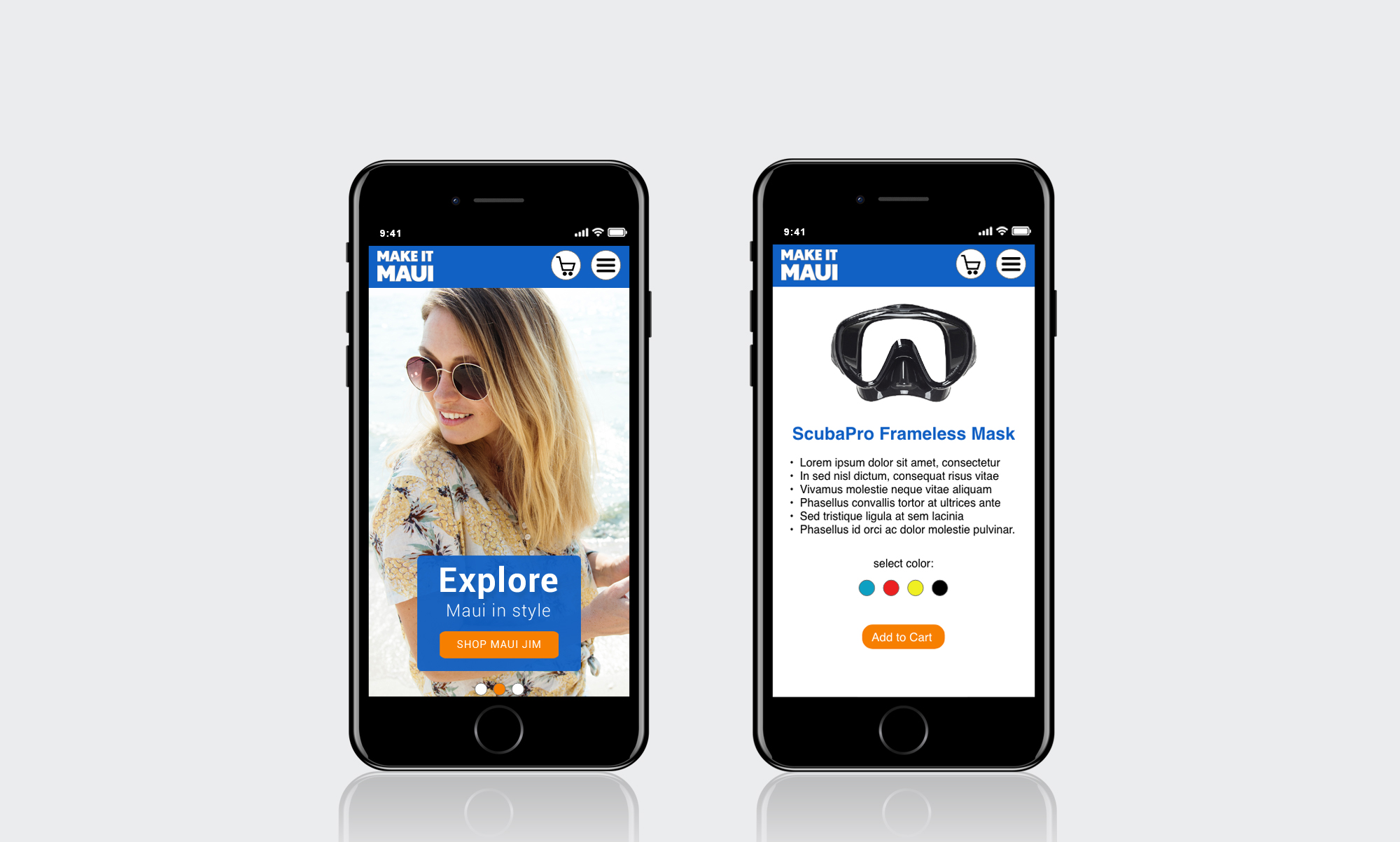
After analyzing the Adventure Store version 1.0, GPS Marketing decided that an upgrade was in order. I proposed converting the store into a skinnable microsite with program themed branding. It was decided that both desktop and mobile concepts would be presented to stakeholders.
My Role:
Information Architecture, User Task Flow, Wireframes, UI Mockups, Prototype
Tools:
Axure, Adobe XD, Photoshop
Client:
Galactic Performance Solutions
Part 1: Desktop Experience
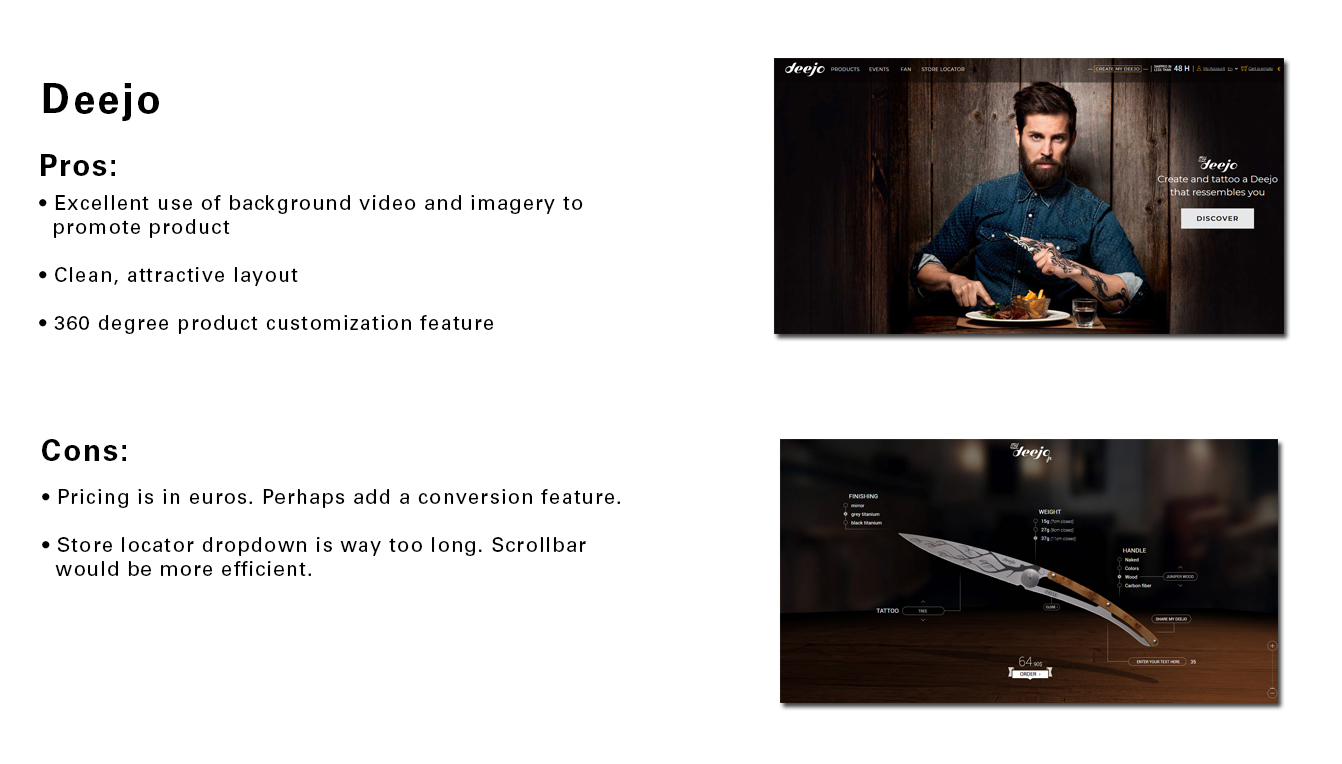
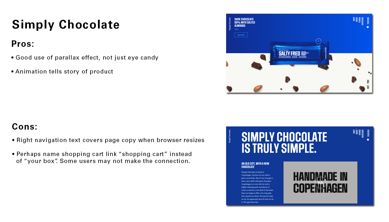
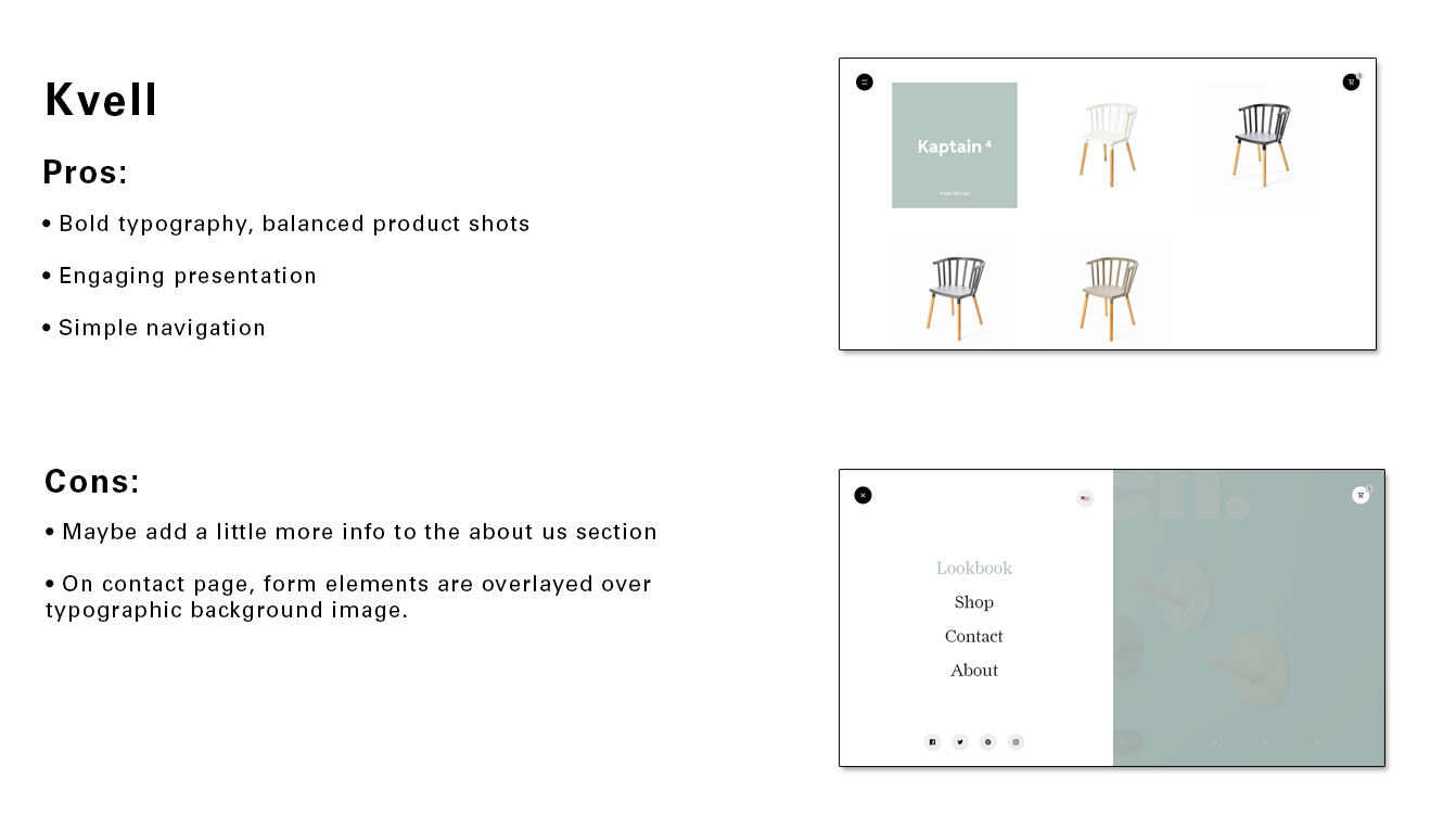
Competitive Analysis and Research
In order to get some inspiration for possible designs, I evaluated ecommerce sites that exhibited a flair of creativity. I also noted some well-designed shopping cart patterns that could be utilized in the Adventure Store concept.
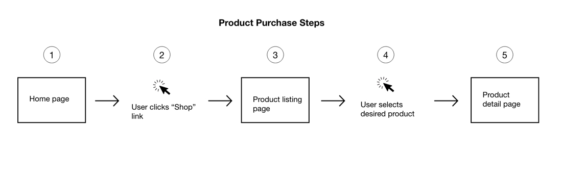
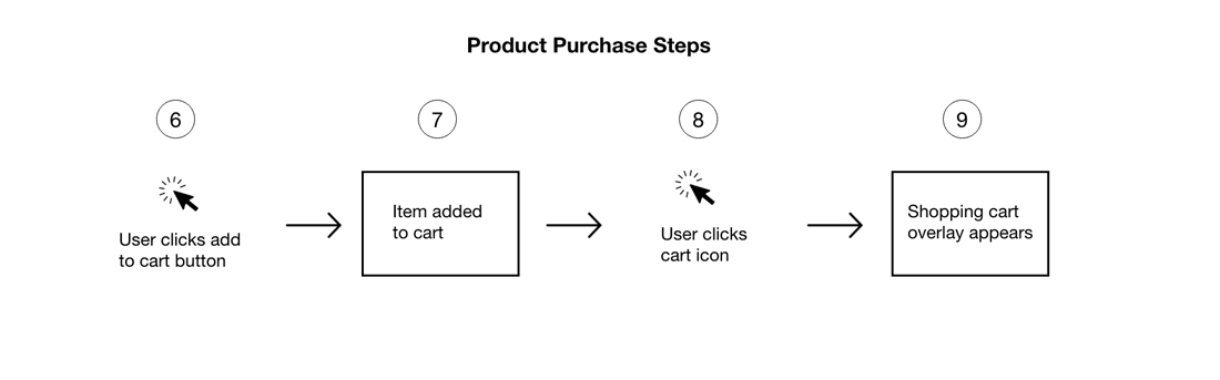
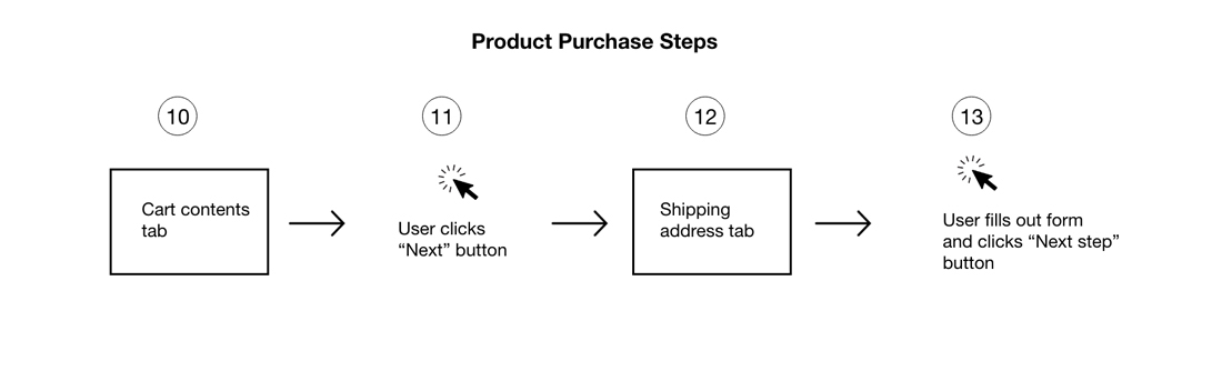
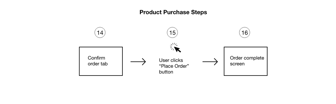
User Task Flow
Although the Adventure Store microsite was fairly simple, I decided that it would be worthwhile to map out the flow users would experience when making a purchase.